



Donohue Wealth Management
A modern yet trustworthy website for an independent financial planner
Product
Responsive web design
Role
UX research, UX/UI design, branding, user testing
Timeline
May-June 2026
View final prototype
The problem
Matt Donohue decided to branch out from him parent company, launching an independent financial planning practice. He had no brand, no site, and a crowded category of competitors who all look the same. The challenge was to create a site that differentiates him from his parent firm while maintaining client trust, all from scratch.
The goal
Prospective clients are making some of the most consequential decisions of their lives. They needed to feel understood, not sold to. So I framed the work around three goals: communicate independence and a clients-first approach without the jargon, address four distinct client types, each arriving with a different decision, remain maintainable by one person.
Business constraints
Squarespace, no dev team
The site had to live on Squarespace so Matt could own and edit it. Custom interactions were built within the platform's code limits: no paid plugins, no business-tier upgrade.
Maintainable solo
No designer on retainer after launch. Everything had to be documented and systematized so one non-designer could successfully scale it.
Fiduciary & regulatory
As a registered advisor, copy and claims had to stay compliant: disclosures, no performance promises, careful language around "fiduciary" and "fee-only."
Lean & fast
A startup practice on a startup budget. Roughly six weeks, one person, favoring a small, high-quality set of pages over sprawl.
Empathize
Research and discovery
To understand the potential users of the site I conducted research primarily through a competitor analysis and focused meetings with Matt.

Competitive analysis of four independent firms
Empathize
Key insights
Looking at four competitor sites, the same thing kept happening. The polished firms hid their message under a pile of awards or walls of text, and the weaker ones never really landed on a message at all. That's the opening for DWM. Lead with the person you're talking to, not the credentials, pick one audience and one clear next step, and let the design actually stand out in a space full of dated, templated sites. Design isn't decoration here. It's the whole point.
Empathize
Personas
J
James
The pre-retiree
"Can I actually afford to stop working?"
Five to ten years out, ready to turn a career of saving into a durable income plan .
Goal statement
Confidently answer “am I on track?” and replace anxiety with a clear, durable retirement plan.
S
Sierra
The high earner
"My compensation is complicated"
Executive with equity and deferred comp who needs proactive tax strategy, not a once-a-year checkup.
Goal statement
Coordinate complex comp and taxes proactively so nothing is left on the table year to year.
C
Caroline
The business owner
"My business is my net-worth"
Wants structure, succession, and a way to convert what she's built into lasting personal wealth.
Goal statement
Turn business value into secure personal wealth with a clear succession and exit path.
M
The Miller Family
The high net worth family
"We are thinking generationally"
Multigenerational planning, advanced strategies, and access to alternatives with a coordinated team.
Goal statement
Preserve and transfer wealth across generations through a coordinated, advisor-led team.
Empathize
Information architecture


Insights to ideas
Once I understood who I was designing for and the problems they were facing, I moved into a brainstorming phase. I sketched through as many ideas as possible, exploring different layouts, flows, and approaches without worrying about getting it right the first time. This rapid iteration helped me think broadly before narrowing in, making sure I wasn't settling on the first solution but the right one.
Digital wireframes
Before any color or type, I wire-framed every primary page as greyscale blocks, pinning down hierarchy, section order, and the content each module needed to carry. Because this needed to be a responsive website, I designed both desktop and mobile versions,


Building the brand
The design of DWM began with the colors. It was clear the the default financial planning palette uses deep blues and greens, and it was important to Matt that we didn't stray too far from the norm to maintain recognition and trust. However, Matt also wanted to reflect his fresh perspective and differentiate himself from the crowd. After a few iterations, we landed on an earthy green palette with gold accents. The coloring worked well with the imagery Matt gravitates towards, and visually conveys his grounded, thoughtful approach. The palette came together to reflect the modern, yet timeless approach of DWM: something that is both reliable and progressive.
Forest · #2F4B34
Sage · #7A9680
Gold · #D4A574
Cream · #FAF9F5
Warm Cream · #F0EFE8
Ink · #343434
Logo design
The logo is an overlapping W and M, chosen to reflect the firm's purpose. I set the letters apart using green and gold, the primary brand colors, and suggested line continuations that give the mark visual interest. The letterforms also let me build in a mountain motif at the client's request, evoking the stability and trust people look for in a wealth management firm. Once the submark was established, I developed variants to fit different formats using the full firm name. Additionally, I developed inverse versions to work on dark backgrounds.


Desktop
Display
EB Garamond · 76px
h1
EB Garamond · 52px
h2
EB Garamond · 28px
h3
EB Garamond · 19px
body
DM Sans · 15px
caption
DM Sans · 11px
EYEBROW
EB Garamond · 11px
Button
DM Sans · 15px
Mobile
Display
EB Garamond · 40px
h1
EB Garamond · 32px
h2
EB Garamond · 20px
h3
EB Garamond · 15px
body
DM Sans · 15px
caption
DM Sans · 11px
EYEBROW
EB Garamond · 11px
Button
DM Sans · 15px
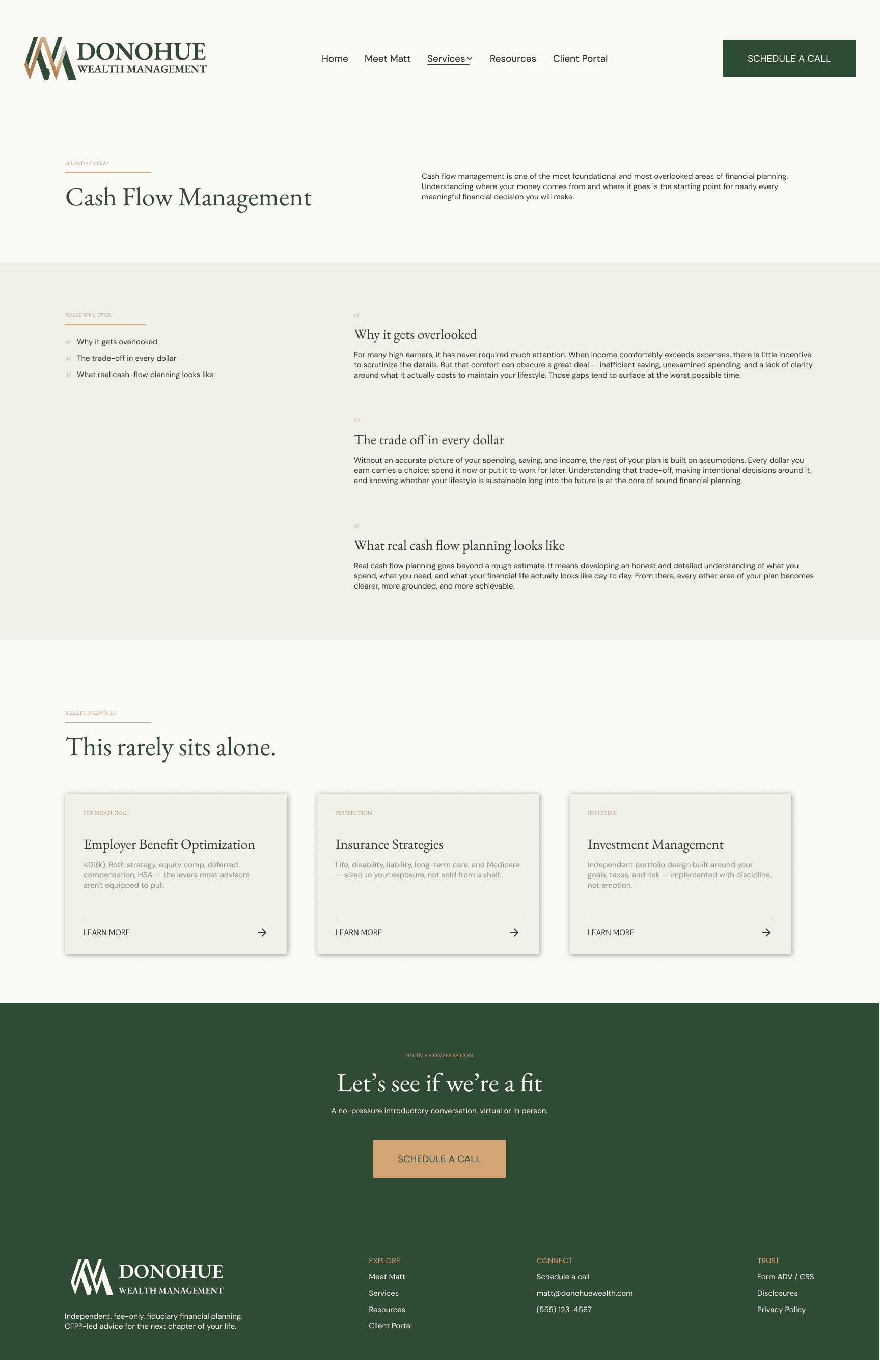
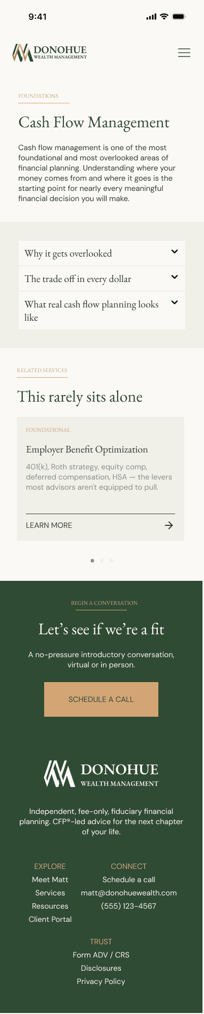
Mockups
Once the color palette and brand assets were established, I began taking the wireframes and building out mockups in Figma. Because the project was a responsive website, I designed both






Testing plan
Because the site needed to go through compliance checks before going live, I was unable to outsource testing on UX forums as I have done in past projects. However, I still found it was essential to send off my designs in some way for feedback, so in addition to Matt, trusted friends and family went through the prototypes.
I ran moderated sessions with five participants, each walking through the prototype on mobile and desktop, then completing a standard 10-question System Usability Scale (SUS) survey at the end of their session.
86.5 SUS
before iterations
The prototype scored an average SUS of 86.5, placing it in the "good" range. Individual scores clustered tightly between 78 and 90, suggesting a consistent experience across participants rather than a split between people who found it easy and people who struggled.
Three findings surfaced consistently enough to act on, and each aligned with the quantitative result: a usable product with specific, fixable friction points.
Key Insights
Content-heavy pages felt dense on mobile
Four of five participants found the longer pages too much to get through on mobile, scrolling quickly past sections rather than reading them. The Meet Matt page drew this reaction most, where several long paragraphs stacked with little visual break made the mobile experience feel heavier than the desktop layout.
The only next step felt high-commitment
Two of five participants noted that scheduling a call was the sole available action, which felt like a lot to ask while they were still early in evaluating the firm. Both wanted a lower-stakes way to engage before committing to a conversation. This suggested a softer secondary path alongside the primary CTA. Worth validating against the client's lead-quality goals first, since a solo fiduciary may intentionally prefer only high-intent bookings.
The services overview was easy to miss in the nav
Three of five participants found that within the Services dropdown, the link to the full overview page was visually indistinguishable from the individual service links, making it easy to miss that a combined overview existed at all. This suggested giving that entry clearer priority in the menu or a type treatment that signals it is a parent page rather than a peer.
View final prototype
Reflections and moving forward
The final prototype reflects what testing surfaced: tighter mobile pacing on the content-heavy pages and a clearer path through the navigation. The third finding, adding a lower-commitment CTA, I raised with the client, who opted to keep scheduling a call as the single conversion point to prioritize high-intent leads, a reasonable tradeoff for a solo practice. The 77.5 SUS score confirmed a solid foundation, and testing gave me a prioritized set of refinements to weigh against real business goals.
This project gave me a real sense of a real world assignment with real limitations. It was exiting to work so closely with someone who had a very specific idea of how he wanted to present himself to clients. There was a lot of back-and-forth which meant the project took much longer than I anticipated it would, but I really enjoyed going through the motions of a real UX project.