



Canopy
A plant identification and care guidance app that helps beginners understand exactly what their plant needs, so care stays simple and consistent.
Product
Plant identification and care guidance app
Role
End-to-end UX designer: research, design, testing
Timeline
March–April 2026
View final prototype
The problem
Plant owners, especially beginners, often struggle to identify their plants and understand how to care for them properly. Existing information is inconsistent, overly generic, or difficult to apply, which leads to confusion, forgotten care routines, and low confidence. As a result, users feel frustrated and many plants are unintentionally neglected or overwatered.
The goal
Design an intuitive mobile app that helps users identify plants, access clear and personalized care guidance, and stay consistent with plant care routines — ultimately building confidence and improving plant health.
Empathize
Understanding plant care confusion before designing solutions.
To better understand user needs and behaviors, I conducted a mix of secondary research and light primary research, including surveys and online community analysis across plant-focused forums and Reddit groups.
Difficulty identifying plants accurately
Users struggle to identify plants they already own or encounter, especially when different species look similar. This leads to confusion and prevents them from giving proper care.
How might we…
Help users quickly and accurately identify plants so they can confidently understand what they are caring for?
Inconsistent or confusing care information
Plant care advice online is often conflicting or too generic, leaving users unsure how often to water, how much light is needed, or how to adjust care seasonally.
How might we…
Simplify and personalize plant care guidance so users know exactly what their specific plant needs?
Forgetting or mismanaging care routines
Users frequently forget to water, fertilize, or repot their plants, especially when managing multiple plants with different needs.
How might we…
Help users stay consistent with plant care tasks without feeling overwhelmed or reliant on memory?
Lack of confidence in plant care decisions
Beginners in particular feel anxious about “doing it wrong,” which can lead to overwatering, neglect, or giving up on plant ownership altogether.
How might we…
Build user confidence in plant care decisions so they feel capable and successful as plant owners?
Empathize
Key insights
Users rely on guesswork
Many use Google or social media to identify plants and receive inconsistent or incorrect results.
Advice lacks clarity
Vague phrases like “water occasionally” or “indirect light” are hard to translate into action.
Care is hard to maintain
Users want to care for plants but forget tasks or struggle to track different needs across multiple plants.
Emotion driven
Users feel attached to plants and experience guilt when they don’t thrive, creating room for encouragement.
Empathize
Personas
Problem statement: Oscar needs a basic plant-identifying app because he buys plants for aesthetics, doesn’t know how to properly care for them, and just needs to keep them alive.
Hypothesis: If we provide fast, camera-based plant identification with high-confidence results and care tips, then beginner users like Oscar will feel more confident because they can quickly understand what they own.
Goal statement
A simple and intuitive way to identify plants, receive clear care instructions, and stay on track with basic maintenance so users can confidently keep plants alive without feeling overwhelmed or inexperienced.
M
Maria
60 · Retiree · Plant hobbyist
Problem statement: Maria actively enjoys caring for her plant collection as a retirement hobby. She needs an app that can identify rare species and keep track of care to grow her garden and help her plants thrive.
Hypothesis: If we add rare species to the database and allow users to log watering, growth, and plant health over time, then users will return more frequently because the app becomes a centralized management tool.
Goal statement
A highly accurate and customizable plant care tool that provides detailed, species-specific insights and tracking capabilities to optimize the health, growth, and management of large plant collections.
Empathize
Information architecture


Insights to ideas
Once I understood who I was designing for and the problems they were facing, I moved into a brainstorming phase. I sketched through as many ideas as possible, exploring different layouts, flows, and approaches without worrying about getting it right the first time. This rapid iteration helped me think broadly before narrowing in, making sure I wasn't settling on the first solution but the right one.
Paper wireframes
I began with paper wire framing to test a bunch of different concepts before picking a direction.

HOMESCREEN

HOMESCREEN

LIBRARY

PROFILE

SCAN RESULT
Digital wireframes
Every screen started as a low-fidelity wireframe before it became a polished mockup. I used lo-fis to work through layout, hierarchy, and user flow without getting distracted by visual details too early. Once the structure felt right, I moved into high-fidelity mockups, applying the design system to bring each screen to life. This process let me catch usability issues early, test different layout options quickly, and make sure the final product was grounded in function, not just aesthetics.
scan flow
Profile to wishlist flow
Completing a task flow
Building the brand
Forest · #2C5530
Sage · #B8C9A6
Sage Light · #D4E5C8
Clay · #C19177
Canvas · #FAF7EE
Surface · #FFFFFF
CANOPY
A canopy is what protects the smallest, most vulnerable plants on the forest floor.
That idea of quiet protection shaped every color decision. I wanted the user to feel calm and grounded in their abilities, whether new or seasoned. Forest green evokes trust and knowledge, sage and clay bring in warmth and variety, and the cream canvas keeps the whole app feeling like natural light rather than a screen.
Display
Fraunces · 48px · 400
h1
Fraunces · 32px · 400
h2
Fraunces · 20px · 400
h3
Inter · 18px · 600
body-lg
Inter · 17px · 400
body
Inter · 15px · 400
body-sm
Inter · 13px · 400
caption
Inter · 12px · 300
OVERLINE
Inter · 12px · 600
Button
Inter · 15px · 600
Mockups + Hifis
Once I had a clear direction for Canopy's layout, established brand guidelines, and a desgin system built out in Figma, I moved into building out mockups. High-fidelity prototypes let me test real content, spacing, and interactions in a way that felt true to the final product. This stage was where the app started to feel real, giving a clear picture of how users would actually experience Canopy before development.

Onboarding and watering flow
Scan flow
Calendar flow
Search flow
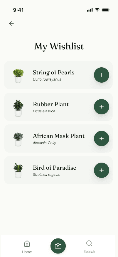
Profile and wishlist flow
Empty states and edge cases

Empty Dashboard

Empty Calendar

No scan match
Testing plan
I conducted unmoderated usability testing with 5 participants, each given a Figma prototype link and a set of 4 realistic tasks to complete independently (water a plant, scan and add a plant, view wish list and calendar, search for plants). After completing the tasks, participants filled out a short feedback form rating ease of use, navigation, and visual appeal on a 1-5 scale, along with open-ended questions about points of confusion or unmet expectations. I then synthesized the responses to identify recurring pain points mentioned by multiple users, which directly informed the design iterations detailed below.
Objectives
Task success and efficiency
Measures whether users can complete key tasks accurately and without unnecessary friction. Tracks completion rates, time on task, and errors to reveal where the design helps or hinders.
Find-ability and navigation
Evaluates whether users can locate what they need without confusion, testing if the navigation and labeling match users' mental models.
Satisfaction and perceived ease
Captures how effortless or frustrating the experience felt, regardless of success. Distinguishes tasks that were completable from ones that actually felt easy.
Insights
Search filtering
3 out of 5 users flagged the plant tags during testing, wanting a way to filter results by them. In response, I added clickable tags to the top of the scrollable section, letting users filter by specific attributes like 'Beginner Friendly' to quickly find plants that match their needs.
Calendar access
4 out of 5 users noted that the calendar was hard to find, since it was only accessible through the profile page. In response, I added a 'See All' button, mirroring the Library preview pattern on the main dashboard, so users can jump straight to the calendar without navigating away from the home screen.
Reflections and moving forward
This was a really fun concept to work on! Given that it was conceptual, I got to explore so many different ideas for both the functions and design of the app. That also definitely overwhelmed me at times because there were so mny things I hoped to include, but realistically wanted to focus on bringing a few, solid functions to life.
It was also really important to me to make the app as intutive as possible as gardening is a hobby that tends to attract an older demographic. I wanted people like my grandma, who loves caring for her garden and pointing out different flowers on our walks, to not feel overwhelmed by an overly-complicated app.
Moving forward, I think it would be fun to add a social media aspect to the app. A feature where you could follow your friends gardens and post photos or progress updates would be a nice way to increase user engagement and add another aspect to the app experience.